Handwriting comparison means putting two samples side by side and reading the same features in each — slant, size, pressure, spacing, the baseline, and the shapes of the letters — to see how they match or differ. People do it for two reasons: to ask whether two samples were written by the same person, or to see how two different people compare, for compatibility or just for fun. This guide shows you how to compare handwriting step by step, what the differences mean, and what comparison can and can't prove. You can also compare two samples instantly with Graphia.
Two reasons to compare handwriting
The first is identity: are these two notes written by the same hand? Maybe you're curious whether an unsigned card matches a friend's writing, or you want to see how much your own handwriting has drifted since school. The second is contrast: how do two different people's hands compare? Couples and friends do this for fun, reading similarity and difference as a playful take on compatibility. Parents sometimes compare a child's writing with their own, and people learning a language compare their hand to a native model. The use cases differ, but the method is the same.
Both are worth doing — with one honest caveat up front. This is curiosity-grade comparison, not forensic document examination. It's great for self-reflection, conversation, and fun, but it can't prove who wrote something in any legal or official sense. Keep that in mind and the rest is pure enjoyment. If you're new to reading the individual features, our guide to analyzing handwriting from a photo covers each one first.
How to compare two handwriting samples
The method is simple: read the same feature in both samples, one at a time, and note whether it matches. Work down this list:
- Capture both well. Ideally on the same kind of unlined paper, in similar light, photographed straight on. Like-for-like samples compare far more fairly than a rushed note against a careful one.
- Slant. Do the tall letters lean the same way — both right, both upright, both left? Slant is one of the most stable signatures of a hand.
- Size. Are the letters a similar height, or is one markedly larger? Compare the middle-zone letters like a, e, and o.
- Pressure. Look at the darkness and weight of the downstrokes. Heavy in one and feather-light in the other is a real difference.
- Spacing. Compare the gaps between words and between lines — tight and crowded versus open and airy.
- Baseline. Does each line of writing rise, fall, or stay level? On unlined paper this is very telling.
- Letter forms. This is where individuality lives. Look at distinctive letters — how each writer makes a capital, a looped l, a crossed t, or an unusual f. Quirks that repeat in both samples are the strongest match.
- Signatures. If both have a signature, compare those separately; the signature is its own deliberate symbol.
How many samples do you need? More is better. A single line from each side is enough for a first impression, but a few sentences give the features room to repeat — and repetition is what makes a match convincing. One matching t-bar could be chance; the same t-bar five times is a habit. If you're comparing your own writing over time, keep the prompt similar too: copying the same sentence on each occasion removes content as a variable and lets the pure mechanics show through.
Then tally it up. A few matching features is weak; a consistent match across slant, size, pressure, spacing, and the same odd letter quirks is a strong resemblance.
Not every feature carries equal weight. Slant and size are easy to match by coincidence — plenty of people write upright and medium-sized — so they're weak evidence on their own. The distinctive letter forms are where individuality concentrates: a particular way of looping a g, an unusual capital, a t crossed with a flourish. When those personal quirks repeat across both samples, that's the strongest sign you're looking at one hand; when they clash, two.
Comparing your own handwriting over time
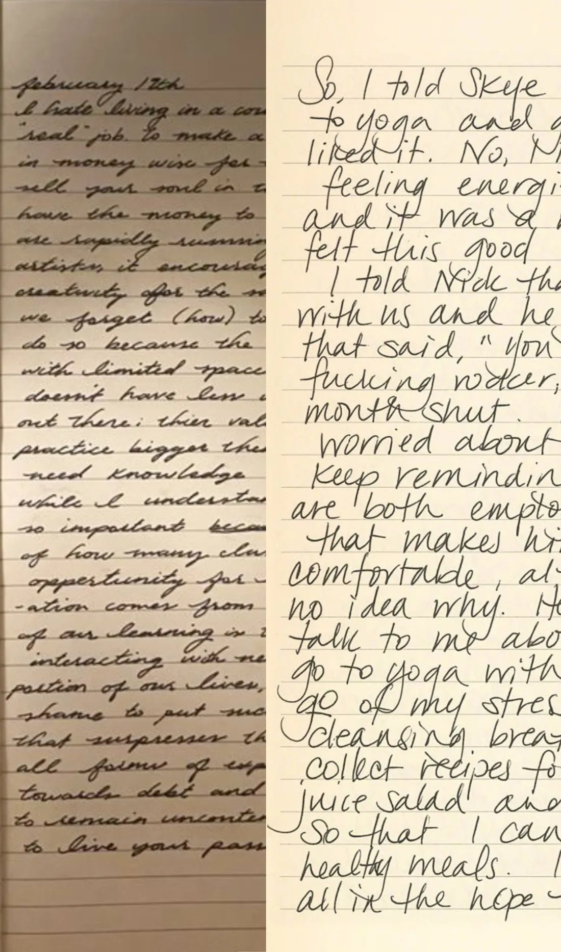
The most rewarding comparison is often with yourself. Pull out something you wrote years ago and set it beside a fresh sample. You'll usually find the bones are the same — your slant and letter forms are remarkably persistent — while the mood-driven features have shifted: a baseline that used to climb now sits flat, or your once-heavy pressure has lightened. That gap is a little time capsule of how you've changed.
It works on shorter timescales too. Photograph a few lines on a calm day and again on a stressful one, and the differences in pressure, size, and baseline map your state of mind more honestly than memory does. Keeping a dated archive of samples turns those one-off comparisons into a record you can actually watch evolve. It's the same idea as a fitness photo log, but for your inner weather — and because your letter forms barely move, any change you do see is signal, not noise.
Comparing two different people
Set two people's writing side by side and the contrasts jump out: one large and sprawling, the other small and precise; one racing and connected, the other carefully printed. Read socially, big differences aren't a problem — they often describe two people who balance each other, one expressive and one grounded. Close similarities can suggest shared temperament or simply a similar upbringing in how they were taught to write. Treat it as a fun lens on how two personalities sit together, not a verdict on a relationship. It makes a surprisingly good icebreaker, too: handing someone a comparison of your two hands gives you both something to react to.
You can run either kind of comparison on your own samples in Graphia — photograph two pages and it lines up every feature for you.
A quick worked comparison
Say you're comparing two birthday cards and wondering whether the same person wrote both. You start with slant: both lean gently right — a match. Size is close, both medium. Then pressure splits them: one bites into the paper, the other is feather-light. Spacing is similar, and both baselines rise a little. Finally the letter forms: both make the same distinctive looped y and cross their t's high. Tally it up — five features broadly match, including a repeated quirk, and the one difference, pressure, is exactly the kind that shifts with mood or a different pen. That's a strong resemblance: the sort that says "probably the same hand" while stopping well short of proof.
Run the same exercise on two clearly different people and you'll see the opposite — mismatches stack up fast, and no amount of squinting makes them line up. The tally does the work; you're just counting honestly and resisting the urge to force a conclusion.
Mistakes that throw off a comparison
- Comparing unlike samples. A rushed sticky note against a carefully written letter exaggerates differences that aren't really there. Match the conditions where you can.
- Print versus cursive. The same person printing in one sample and joining their letters in another will look like two people. Compare like with like.
- Reading one feature. Matching slant alone proves nothing — a huge share of people share a slant. Weight the distinctive letter forms most.
- Ignoring natural variation. Nobody writes identically twice; expect small differences even from one hand on one day.
- Treating a resemblance as proof. A close match is interesting, not evidence. Keep the stakes low and the curiosity high.
Same person or not: what comparison can prove
Here's the honest limit. Two samples looking alike is suggestive, not conclusive — and two samples looking different doesn't rule out one author either, because anyone's handwriting varies with mood, speed, the pen, and the surface. Write standing up versus at a desk, with a fountain pen versus a ballpoint, rushed versus relaxed, and the same person produces noticeably different pages — which is precisely why matching the conditions of both samples matters before you read anything into the differences. Real forensic document examiners settle questions of authorship with microscopes, ink and paper analysis, and training that goes far beyond eyeballing slant and size; they treat it as careful evidence, not a quick read.
So use comparison for what it's good at: noticing resemblance, tracking your own change, and starting a conversation. If anything genuinely hangs on who wrote a document — a contract, a legal matter — that's a job for a qualified examiner, not a phone app. The interpretations here also come from graphology for the Latin alphabet, so other scripts won't compare cleanly. The point isn't to play detective — it's to enjoy noticing how two hands echo or diverge, and what that hints about the people behind them.
Compare handwriting online or in an app
You can do all of this by eye, and learning to is genuinely satisfying. But lining two samples up fairly — same zoom, same orientation, feature beside feature — is fiddly on paper, which is exactly where an app helps. Graphia includes a dedicated Handwriting Comparison: photograph two samples and it reads each one's features and shows them side by side, so you can see at a glance where they match and where they part. It's the same engine that powers its single-sample read, just pointed at two pages at once. It keeps both readings, too, so you can revisit a comparison later or add a third sample down the line — handy if you're tracking how your own hand drifts year by year.
If you're weighing tools, our guide to choosing a handwriting analysis app covers what to look for. Browser tools rarely handle two images well at once, so for side-by-side work an app is the practical choice. Available on iPhone and Android, Graphia turns two photos into a clear, side-by-side comparison in seconds. Browse more handwriting guides to go deeper.