Your handwriting is a habit your brain runs on autopilot — which is exactly why it leaks your personality. Look at the right signs and you can read how outgoing someone is, whether they lead with their head or their heart, how much drive they're running on, and how they think. Here are seven personality traits your handwriting reveals, the specific sign behind each, and what to look for. You can read these on your own page in a minute — or get an instant read with Graphia.
How handwriting shows personality
By adulthood you no longer think about forming letters; the movement is automatic, shaped by the same nervous system that carries your temperament and mood. That's why your writing is recognisably yours, why no two people taught the same school script end up writing alike, and why your own hand changes when you're calm, rushed, or tired. Graphology reads those habits as clues to personality — a tool for reflection, not a clinical test. It has a long history in Europe, where it's still used informally in coaching, journaling, and self-reflection: less a hard science than a structured way to pay closer attention to yourself.
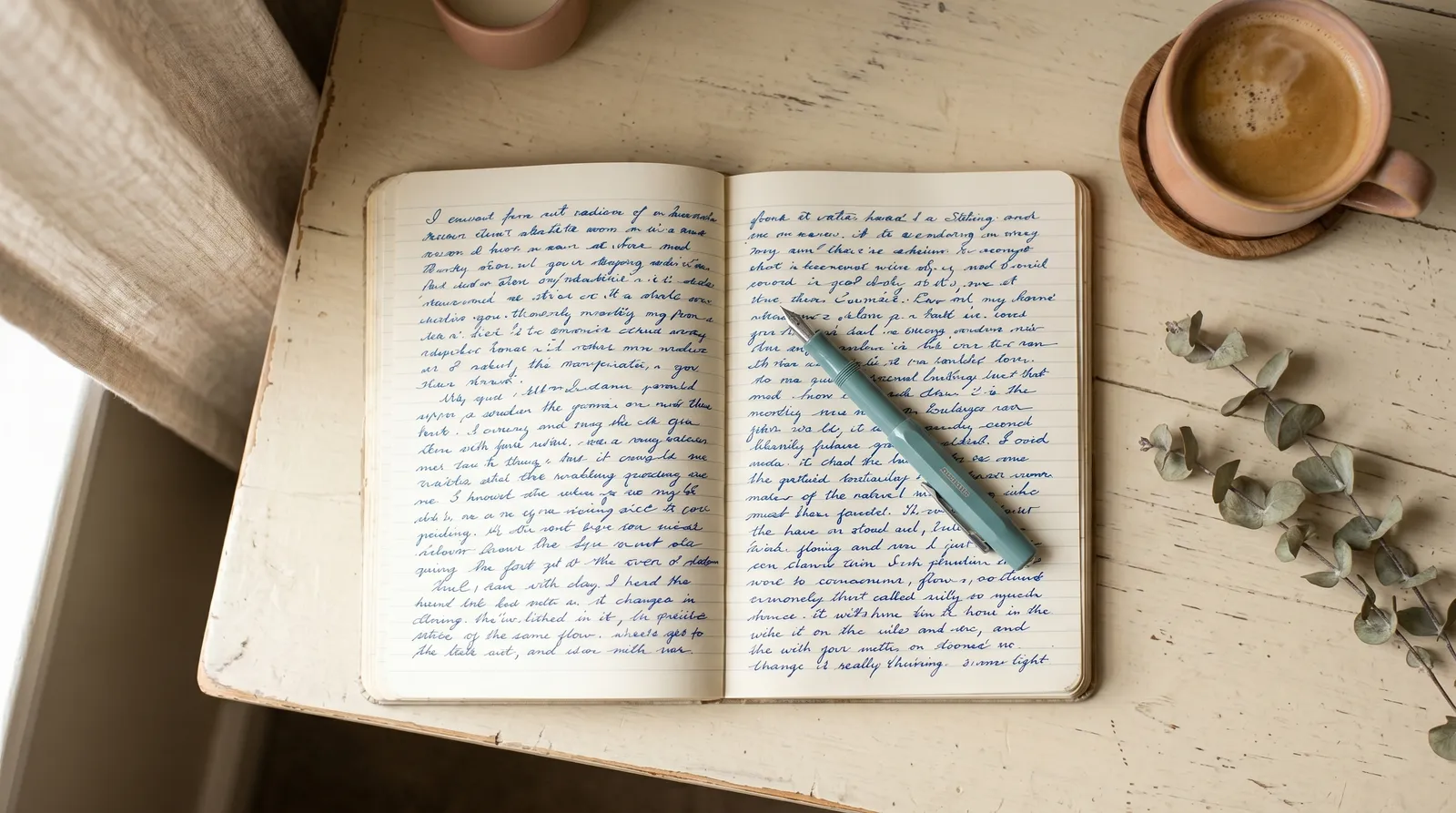
You don't need neat handwriting for any of this; you need natural handwriting. A few relaxed lines in your everyday hand reveal far more than one careful, posed sentence. If you want the full method, including how to photograph a sample so the details survive, see our guide to analyzing handwriting from a photo. Here we go straight to the traits.
7 personality traits your handwriting reveals
1. How outgoing you are — letter size
Size is the quickest read of sociability. Large writing belongs to people who are comfortable taking up space and being noticed — outgoing, expressive, drawn to an audience. Small, compact writing points to focus, modesty, and the ability to concentrate deeply; these writers often prefer a few close connections to a crowd. Always compare the size to the space available: writing small on a big blank sheet says something different from being cramped for room. The extremes are the loudest — a hand that sprawls across the page, or one that shrinks into a tiny corner, is making a clear statement about how much room its owner wants to take up in a room of people.
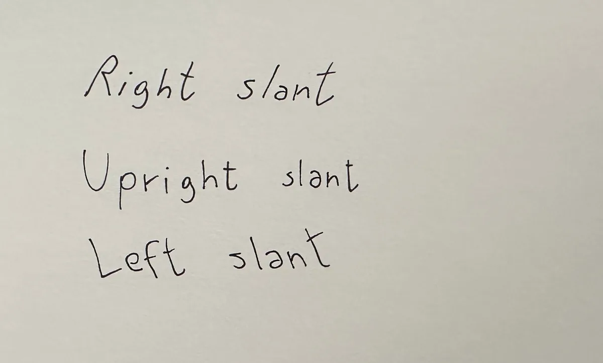
2. Whether you lead with your head or your heart — slant
The slant of your tall letters tracks emotional expressiveness. A rightward slant leans toward warmth, sociability, and decisions guided by feeling; an upright hand toward self-control and head-over-heart reasoning; a leftward slant toward reserve, or keeping emotion private. To judge it, sight along the ascenders — the tall strokes of letters like l, h, and t — where the lean is clearest. A slant that wanders within a single sample, tipping right on one word and upright on the next, often signals changeable moods or someone pulled between heart and head.
3. Your optimism and energy right now — the baseline
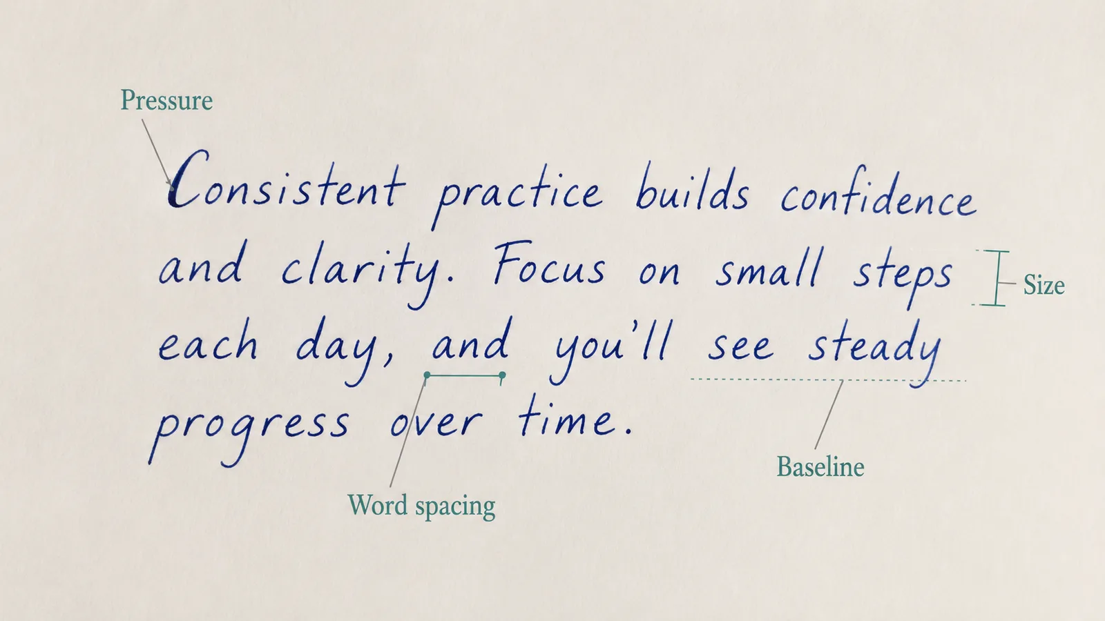
Write on unlined paper and watch the invisible line your words sit on. A baseline that rises across the line is linked to optimism, energy, and an upbeat mood; one that sags toward the end suggests tiredness or low spirits; a wavy baseline points to flexibility, or sometimes a restless, changeable state. Lay a ruler — or your phone's edge on the screen — under a line to see which way it really goes. Because mood moves the baseline more than any other feature, it's the trait that changes most from one day to the next, which makes it a surprisingly honest read of how someone is doing right now.
4. How much drive you bring — pressure
Heavy, dark strokes you can almost feel on the back of the page point to intensity, drive, and strong emotional investment — people who throw themselves in fully. Light pressure suggests sensitivity, adaptability, and a gentler, more easily-shifting energy. Pressure is the first thing lost in a bad photo, so look at the downstrokes in good light: do they bite into the paper and darken, or barely graze it? A sudden patch of heavy pressure on certain words can even hint at where someone's feelings are concentrated.
5. Your need for space and independence — spacing
The gaps tell you how someone relates to others. Wide spacing between words suggests a need for room, independence, and breathing space; tightly packed words suggest a wish for closeness, or at times loose boundaries. Keep word spacing and line spacing separate: generous space between lines reads as clear, uncluttered thinking, while lines that tangle and collide can mean a busy or overloaded mind. Hold the page at arm's length — if rivers of white run between the words, the spacing is wide; if it all blurs into grey blocks, it's tight.
You can check all of these on your own writing in Graphia — one photo and it reads each sign at once, then turns them into a personality profile.
6. How detail-focused you are — i-dots and t-bars
The small finishing strokes reveal attention to detail. An i dotted precisely and close to the stem, and a t crossed firmly and exactly through the middle, point to a careful, detail-oriented mind that follows through. Dots that drift high or to the right, and crossbars that fly off ahead of the letter, point to a big-picture thinker — imaginative, quick, sometimes impatient with the fine print. The height of the t-bar adds more: a high, firm bar suggests ambition and confidence, a low or faint one more caution or self-doubt.
7. How you think — joined vs broken letters
Look at whether letters connect. Fully joined, flowing writing suggests logical, step-by-step thinking that moves from one idea to the next in order. Frequent breaks between letters suggest intuition — a mind that jumps to conclusions in flashes rather than marching through them. Pure print, with every letter standing alone, often belongs to people who like clarity and control; a fast, fully-linked scrawl to people who think quicker than they can write. Most of us sit somewhere in between, and that exact blend is itself a clue to how you process the world.
Put it together: a quick example
Single signs are hints; combinations are character. Picture a page of medium-to-large writing that slants gently to the right, with even, generous spacing between words, a baseline that lifts a little toward the end of each line, and t-bars crossed high and firm. Read as a group, that's someone sociable and warm, optimistic and energetic in the moment, who likes a bit of breathing room and carries real ambition — a recognisable, consistent person.
Now turn the dials the other way: small, upright letters, tightly packed words, light pressure, and i-dots placed precisely above the stem. The picture flips into someone private and self-contained, careful and detail-focused, who keeps emotion in check and prefers depth to breadth. The seven signs are identical; only the way they line up has changed, and it produces two completely different people. That is exactly why you never read a single feature on its own.
Which traits are fixed, and which change with your mood
Some of these signs are stable and some are passing moods. Size, slant, connectedness, and your i-dot and t-bar habits change slowly — they sit closer to fixed temperament, much the same on a Monday as on a Friday. Pressure, the baseline, and spacing move with your state: tired, stressed, or elated, you press differently and let your lines drift. That distinction is useful when you read a sample. For a portrait of someone's lasting character, weight the stable signs most; to gauge how they're doing today, watch the baseline and pressure. Reading the same hand on a good day and a draining one shows you both at once — the steady traits underneath and the mood riding on top.
Read the whole page, not one letter
The traits above are signals, not verdicts. The real skill is combining them: a right slant plus heavy pressure plus a rising baseline tells a far more consistent story than any single sign on its own. One soaring t-bar doesn't make someone ambitious; the same ambition showing up in the size, the pressure, and the signature does. Remember too that handwriting is a snapshot — mood, tiredness, the pen, even the surface you're writing on all nudge it, so read a relaxed, everyday sample rather than one posed line, and read more than one if you can.
Your signature is read separately, as a picture of the public self you choose to show; see what your signature reveals about you for that. And hold the whole exercise lightly: graphology is a mirror for curiosity and self-reflection, not a diagnosis, and the interpretations here come from the Latin alphabet, so other scripts won't map cleanly onto them.
Why handwriting beats a questionnaire
Most personality tests ask you to describe yourself — and people tend to answer with the version of themselves they'd like to be true. Handwriting skips the self-report. You're not answering questions; you're just writing, and the habits surface whether you intend them to or not. That's the appeal: it reads something you're not consciously curating. It isn't more scientific than a well-built questionnaire, but it's much harder to game, and for a lot of people that makes the result feel more honest — and far more fun to share with a friend.
See your handwriting traits in seconds
Reading by eye is the best way to learn the signs. Once you know them, an app does the work instantly (see how to choose a handwriting analysis app). Graphia reads your handwriting from a single photo, scores each feature — size, slant, pressure, spacing, baseline, and signature — from 0 to 10, and turns them into a rounded personality profile: psychological insights like self-esteem, emotional control, mental clarity, and relational openness, plus a Myers-Briggs–style type and a read of your current mood. You can save readings in a growth diary to watch your traits shift over time, compare two samples side by side, or analyze a friend's writing for fun. Because it reads every feature together rather than one at a time, it catches the combinations a single sign would miss. Available on iPhone and Android, it's the fastest way to go from a page of writing to a full read of your personality. Browse more handwriting guides as the series grows.